
Bitten Apple. Ever wondered what does it mean?
What do these four circles mean in Audi?
Today I am telling you the meaning behind the famous logos. It is some what you have never even imagined of!
BMW

It shows of propeller in motion with blue representing the sky. it is symbol of contrubution of BMW in World War II as they built aircraft engines for German Military.
Mercedes Benz
![]()
Tri star in logo represents the dominance over air, sea and land.
Amazon
![]()
The arrow in logo which somewhere shows a smiling face actually means that amazon have everything from A to Z as the arrow goes from a to z.
Apple
![]()
Bitten apple. Ever wondered what does it mean?
This logo is derived from the Adam and eve story from bible in which the apple was a fruit from the “Tree of Knowledge”.
IBM

The big blue logo with white lines has a hidden meaning for the whole world. The white lines passing through give the appearance of equal sign in lower right corner of the logo.
Mobil
![]()
Although the logo itself doesn’t hides any meaning but the color does. The red represents strength and blue represents faithfulness and security.
Audi
![]()
What do these four circles mean in an automaker? Well the four circles represents the four companies that were a part of Auto-Union Consortium in 1932, named DKW, Horch, Wanderer and of course Audi.
FedEx
![]()
What is so cool about this logo! Ahan, it does is. If you look closely the space between orange colored E and X you will find an Arrow which represents the arrow moving forward toward the future.
Toyota

The three ellipses in the logo represent the heart of customer, the heart of product and the heart of technological process.
Volkswagen
![]()
Logo simply shows the letter of company’s initials. The word “Volks” is german for people and “Wagen” is german for car.
![]()
The Google logo has four primary colors in a row then it’s broken by a secondary color. This was entirely intentional. Google wanted to show that they don’t play by the rules and are also playful without making the symbol bulky. To do that, they just used simple letters and colors.
Adidas
![]()
The Adidas logo looks like a mountain to represent the obstacles that people need to overcome. Originally the logo was just three stripes and didn’t stand for anything. So they kept the three stripes and just made them slanted to resemble a mountain. So go climb the mountain.
NBC

Ever wonder why the peacock has so many colors? It’s because during the 50’s, NBC’s owner was RCA and they had just begun to manufacture color televisions. RCA wanted people who were watching black-and-white televisions to know what they were missing, so they created a colorful logo.
Sony Vaio
![]()
the logo comprises the word VAIO and you’ll see the first two letters represent an analog symbol and the last two letters are binary.
Baskin Robbins
![]()
Take a look at what’s highlighted in pink. It’s a 31, which is the number of flavors they offer. Isn’t cool!
Northwest Airlines
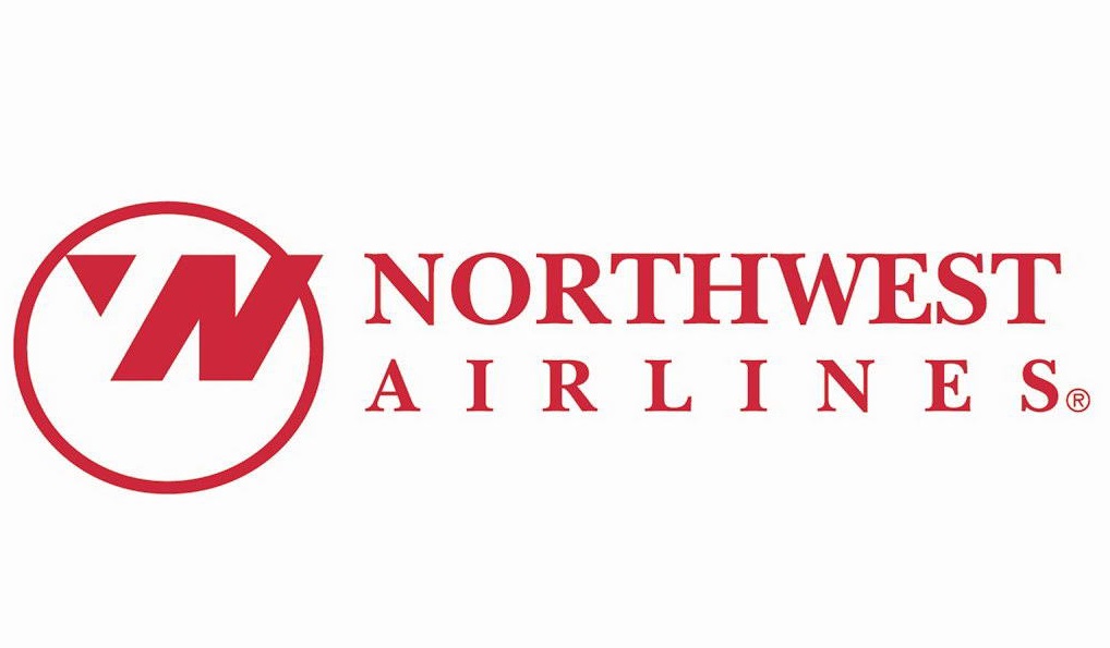
This logo actually has two hidden messages. First, it features an N and a W in negative spaces. Second, the triangle in the circle points northwest as if it’s a compass.
Unilever

Unilever produces so many different products that sometimes it’s hard to keep track of everything they do. Lucky for us, there are symbols for literally everything they make right in their logo.
